
Crafting Oyola - Where Crypto Meets Clarity
Oyola aimed to create a user-friendly crypto trading platform that would simplify the process for both new and experienced users, addressing common pain points like complex interfaces and security concerns in the crypto space.


Team Setup
In this project, i collaborated with quite an interesting bunch of people.
My role
Timeline
My Team
Tech Stack
Some of the tools I used in this project


What was the Problem we faced?
Our users, ranging from crypto newcomers to seasoned traders, struggle with the overwhelming complexity of cryptocurrency platforms, leading to hesitation in trading and lack of trust. Through in-depth user research, we discovered that confusion and a lack of transparency were the main obstacles. Users craved simplicity, but without compromising security. While we initially considered streamlining the interface, quick tests revealed that building trust and ensuring clarity in every transaction were more critical. We needed to create a user journey that feels intuitive and secure, particularly around wallet management, trading flows, and identity verification.
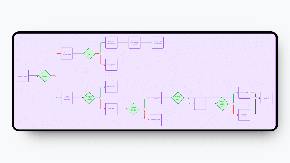
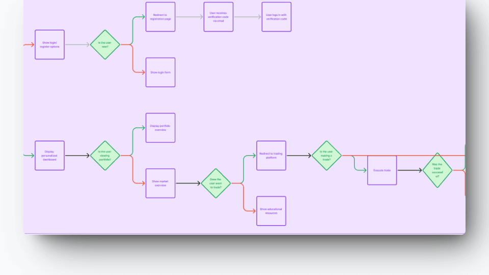
Some User Flows we created
How did we seek to learn about this problem and creatively solve it?
Our Journey:
Understanding User Needs: We started by immersing ourselves in the users' world, from novices to seasoned traders. Through competitor analysis and real user testing, we uncovered the pain points: overly complex interfaces, unclear security protocols, and anxiety about navigating the crypto space. It became apparent that simplicity paired with robust security would be key to solving these challenges.
The Power of Purple: Purple wasn’t just a color choice—it symbolized creativity, luxury, and security, all vital qualities in a space as volatile as crypto. The visual identity needed to reassure users that Oyola is a safe and sophisticated space where they could trade confidently, regardless of experience level.
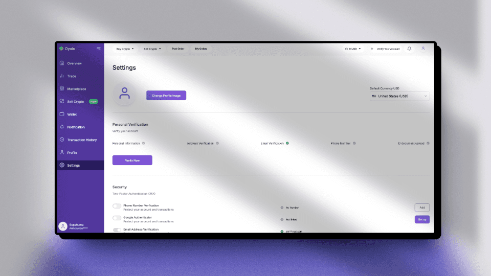
Building Security that Feels Empowering: Security is often seen as a hassle, but we made it a core part of Oyola’s user experience, introducing a smooth, multi-layered verification process. Users verified their identities via email, phone, and ID in a way that felt natural, fostering a sense of trust without overwhelming them.
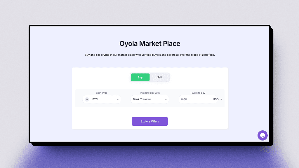
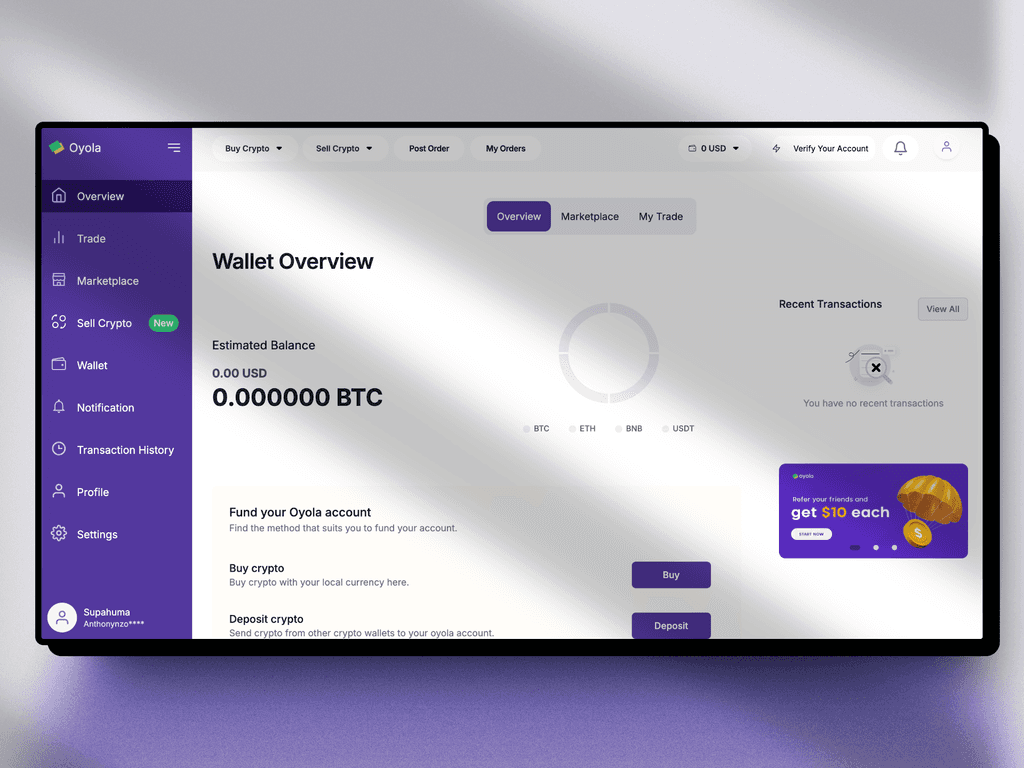
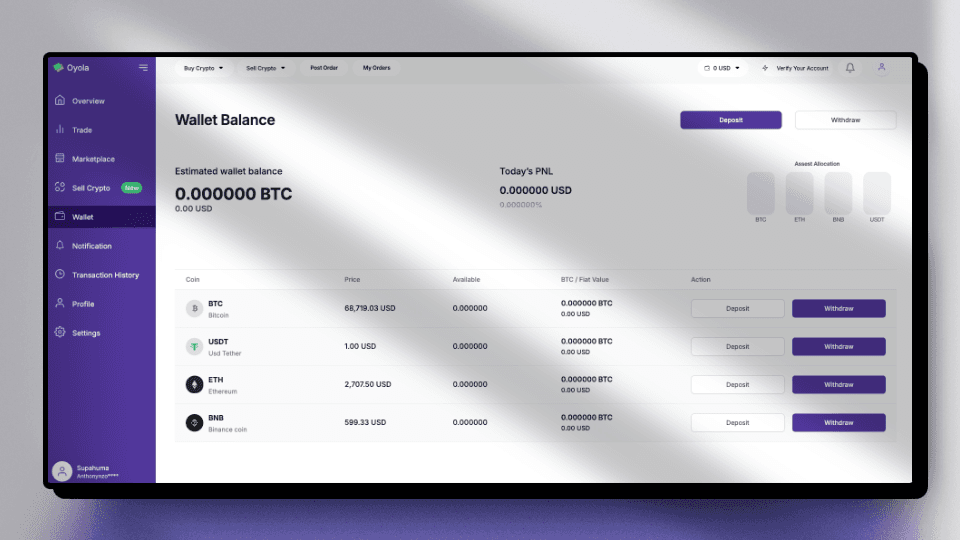
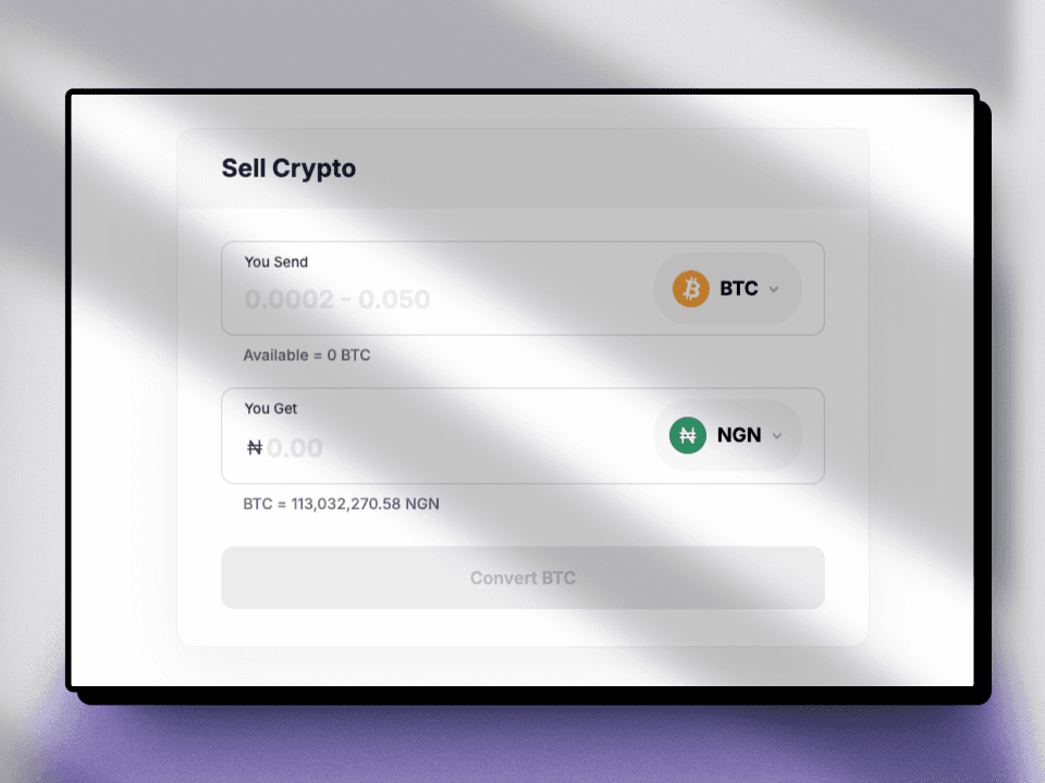
Simplifying Crypto Complexity: The wallet overview was the game-changer. By offering users a quick, clear snapshot of their entire portfolio, we empowered them to make informed decisions at a glance. This dynamic, real-time dashboard made navigating the platform intuitive for beginners and a powerful tool for experts.
Turning Users into Advocates: The referral program wasn’t just about growth—it was about community. By gamifying the process, we incentivized users to invite friends and family into the crypto space, creating a positive feedback loop of organic growth while rewarding loyalty.
Continuous Improvement through User Feedback: We treated each user interaction as a learning opportunity, refining the platform through weekly design sprints. This iterative process, combining creative solutions with data-driven insights, ensured Oyola evolved alongside user expectations, constantly improving their experience.
Outcomes
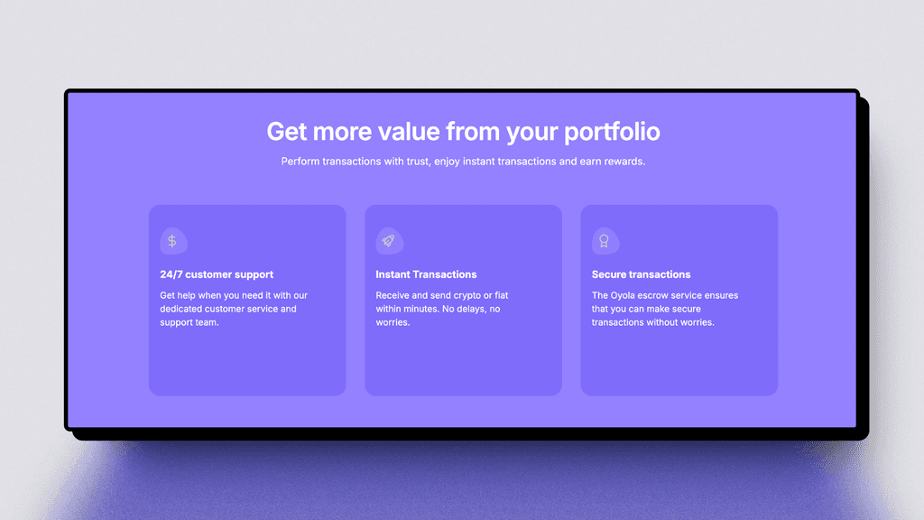
Intuitive Interface: A design that balances simplicity with power, offering users essential tools without overwhelming them.
Security by Design: A seamless, tiered security system that builds trust from the first interaction.
Dynamic Portfolio View: A one-stop dashboard for real-time portfolio tracking and trading decisions.
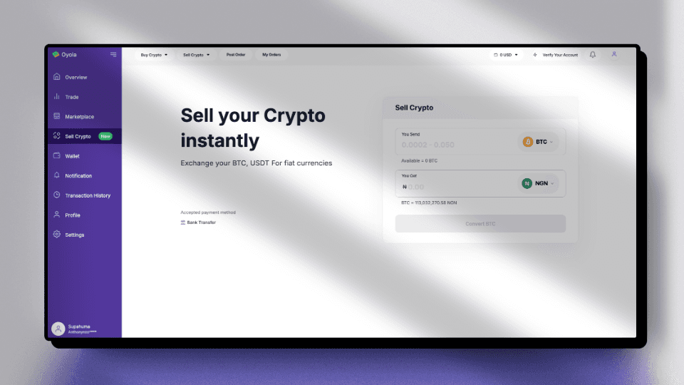
Streamlined Transactions: One-click buy/sell functionality, making trading fast and frictionless.
Oyola Academy: Integrated educational resources to help users continuously expand their crypto knowledge.
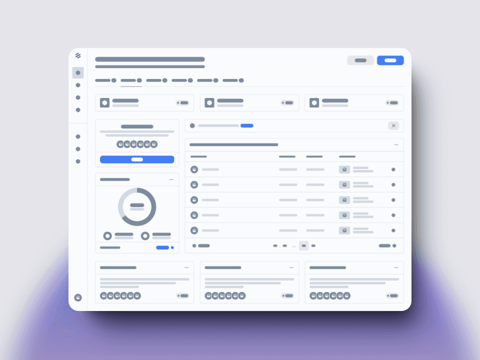
Wireframe and high fidelity Iterations

All Screens


Impact & Results:
Trust Rating: 89% of users reported feeling "very secure" while trading on Oyola.
Conversion Success: 60% of crypto newcomers became active traders after signing up.
Faster Learning Curve: The time to first trade for new users was reduced by 50%.
Organic Growth: User base grew by 40% month-over-month, fueled by the referral system.
High Retention: 78% of users traded weekly, showing deep engagement with the platform.
Conclusion
Oyola didn't just make crypto trading accessible—it turned it into an empowering financial tool. By prioritizing ease of use, security, and education, Oyola bridged the gap between first-time traders and seasoned investors, fostering a community where financial empowerment became achievable for all.
The platform's success wasn’t just in the numbers but in the users' newfound confidence. As one user aptly noted: "Oyola didn’t just teach me to trade; it gave me the confidence to shape my financial future."
Ultimately, Oyola’s journey exemplifies how a well-crafted user experience can transform a product into a trusted financial platform, enabling users to take control of their financial destiny.
